Monday, May 10, 2010

Final Soundslide


Rationale: Here it is, my electronic communications final project! This project encompassed many of the skills that we have been learning all semester. We had to pick a topic we were passionate about, collect pictures relating to the topic and then write a two minute narrative explaining our passion. We had to use Audacity to edit our voice over, ambient sounds and song all into one file. We then used Soundslide to combine the pictures with the mp3 voice over. My goal for the final was to be able to show off everything I have learned this semester with a Soundslide I am proud of.

One of the things I found most challenging about this project was choosing a topic. The day that we met in groups and discussed it as a class, I had no idea what to do. My group members had some suggestions, but nothing I actually wanted to do a whole project on. Then it came to me one day when I was on the phone with my mom, I was begging her to pull some strings and get me tickets to Taylor Swift's concert this summer and it hit me; I LOVE going to concerts. I have been going to shows since I was very young, and since I started going, every artist that I remotely like that comes to town I want to see. Once I got over choosing my topic, I was able to collect the necessary aspects for my project. Another challenge I faced was working with the programs again. I kind of forgot how to work audacity and it took me a few tries to make get my narrative to flow with my song and my ambient sound of crowd cheering. It then took some refreshing of my memory to figure out how to export my "publish to web folder" in Soundslide.

What I enjoyed most about this project was how personable it was. I love how it was on a topic that I got to choose and there was a lot of creativity involved. It was fun to reminisce and go back looking for pictures I had taken at shows I went to. I also liked searching for a good ambient sound and then choosing a song that had a fun feel to go along with my slide show. Though this project was a little complicated because of all the different aspects involved, it encompassed much of what we learned this semester in a way where I could show off what I learned.

What I am most proud of is having a final project that I can show people. Sometimes in school, you have no way of showing off what you learned. With this class, having a blog that can show off all my work all the programs that I learned. I will definitely show my mom my new skills with this blog and project =)

With more time, I would have perfected my audio. There are certain things about my narrative that I do not love, but there are only so many times I can record it. I would have worked harder to perfect my Audacity work.

Thank you for a great semester!


Narrative:
I remember my first concert, it was the Spice Girls and I was in second grade. I was obsessed with them; I used to carry my tape player around with me constantly blasting their music. When one of my classmates told me their mother had just gotten them tickets to the Spice Girls concert, I knew I had to go. I went running home from school, screaming about how my life would not go on if I did not go to their concert. Luckily for me, my mom decided she would have fun at the show too and got the two of us tickets. Since then, I have developed a love for concerts and live music.

I have gone to probably over 50 concerts since then. The amazing feeling of being around live music and the connection I feel with the artist while I am there is what keeps me buying tickets to shows.

There are many other things I love about concerts; one of the best parts for me is the anticipation. My friends and I always play a game where we guess what songs will be performed. I also love listening to that artist the whole car ride to the show to get excited. The whole concert scene and ambience is what brings me back for more. I love the mass amounts of people who can come together to support one artist. I always end up meeting really great people at shows and run into old friends or people who I do not expect to see. Concerts have the best atmosphere and everybody is always in an amazing mood just looking for a good time.

Making concerts all day affairs is just another fun aspect. I love going to summer shows early and barbequing in the parking lot until the show opens up. Sometimes, if I go to a show with a large amount of people, we get a limo or party bus to take us. This extends the event even further, allowing for more fun and excitement.

The pictures in this slide show were taken at Britney Spears, Kanye West, Monster Jam, Dave Matthews, Sam Adams, The Fray, OAR, Spice Girls, Jay- Z, Bob Dylan and Lil’ Wayne. Clearly, there is variety among the shows I go to, but I’m not one to turn down a good concert, I know I’ll always have a good time.

In Design Bibi Card

My design rationale for the bibi card assignment is in my entry entitled Quark bibi card. I posted this for comparison reasons. It is very obvious that my Quark bibi card is better, but I am impressed that my final InDesign one is as good as it is considering the major frustration I experienced while creating it.


Quark Bibi Card


Here is my Bibi card that I made using QuarkXpress. What I was hoping to achieve in this project was a near identical copy of my US News bibi card. When doing this I had to consider: the placement of my words and graphics, along with the size of the fonts, the colors and the typefaces used.

To be perfectly honest, I found this whole project to be very challenging. Though I struggled more with InDesign, doing this assignment in Quark was no breeze. It was very frustrating to not be able to find the EXACT same fonts and colors. It bothered me that I was trying to make a perfect replica because there was no way to find exactly the same fonts. Some of the hardest parts of this project were finding what matched up the best, and how to measure out the spacing on the card. The hardest part of this project was doing it in InDesign. I had never used the program and learning a whole new program to repeat a project I already did was very hard. To resolve my problems and frustrations I would have to take a break and ask my classmates how they did things, and that reassured me I could do it. Another big frustration was finally finishing it in Quark, and then having to do it all over again in InDesign.

Again to be perfectly honest, there wasn't much I enjoyed about this project. I don't mind using Quark, so in the process of creating my bibi card I acquired new Quark skills - which I guess I enjoyed. I enjoyed finishing this project and being able to say that I did it, because when it was first assigned it seemed near impossible.

I am most proud of actually completing the project in InDesign, there were times I was going crazy because I could not figure out how to change the colors of my font. InDesign was much more complicated than Quark, and I had to mostly teach myself to use it. It was a trial and error with figuring out how to make things.

With more time, I wish we had been able to go over InDesign in class. What I had the most trouble with in this project was learning a whole new program just to do the same assignment over again. Also, given more time I would have perfected my InDesign card much more. Some things I had to give up on perfecting so I could finish it in time.

Though I do seem bitter about this project, I am glad it was assigned. I know that the skills I learned will help me sometime in the long run. I am proud of finishing this project and glad that I am done with it forever!!

Sunday, May 2, 2010

Website

DairyJoyWebsite

Here is my webpage!
Since I have never worked with a website program before I was a little hesitant when it came to working with Dream Weaver. Though the site ended up being somewhat self explanatory, I was still a little uneasy about using it. What I wanted to achieve was a basic understanding of an HTML program. I know that sometime in my PR future I am going to have to know how to create (or at least have knowledge about) a website. Learning the basics of Dream Weaver will help me along with this.

What I found most challenging was again just the new program. I don't think I ever would have figured out to how separate the pages if we hadn't gone over it in class! Another challenging aspect of this project was going back into my notes and figuring out how to load my webpage using FileZilla. Once I overcame these challenges, with the help of classmates and my notes, this project became a fun new learning experience!

The aspect I enjoyed most about this project was just the concept or working with a program that makes websites. I never thought I would actually be able to load my own things on the web and now I can. It is a fun exciting feeling and hopefully I will keep the notes I took forever so I can figure out how to do it again. I hope that someday I can learn more complex website creating, using color and pictures to spice it up.

I am most proud of figuring out how to have my images load directly on the page. I know that this was not a requirement but after messing around with the program a little I came to find the "Insert" tab, and was able to put up some pictures of Dairy Joy. Though my website was still very basic and plain, this made it more fun for me and it is something I was proud of.

Since we missed a day of class, with more time I would have liked to use color and pictures. If there was more time in the semester, I would probably get myself more familiar with the program. I enjoyed this project a lot because I feel fortunate enough to know how to put something online now!! Yay!

Thursday, April 22, 2010

Dairy Joy Brochure


For my brochure assignment I did a menu for Dairy Joy. Dairy Joy located on Rt. 177 in Weston, Ma is where I have worked for almost 5 years. It is a small clam shack type of place with soft serve ice cream, the best burgers around, and fried seafood. Dairy Joy is very well known locally and is even a destination restaurant for those who live further away. When Professor O'Connell told us we had to make a brochure in QuarkXpress, I immediately thought to do a menu for Dairy Joy. Dairy Joy does not have a take home menu, or a website so customers often express their frustration in that the only way they can see what we are serving is by coming and looking at the boards. This assignment was a lot of fun for me because Dairy Joy has been such a big part of my life. I have been going there since I was 5 with my family, and working there has given me some of the best summer memories.

What I wanted to achieve in this assignment was representing Dairy Joy as best I could in my designing of the brochure. Who knows, maybe if I did a good enough job we can start having take home menus!

The most challenging part of this assignment for me was the formatting. It was hard working with just an 8 1/2 by 11 piece of paper that is split into threes. It took some getting used to after doing such a large poster project. Though we could use grid lines and borders to divide up the space, it was still hard trying to create the design I had imagined in such a small space. Another frustrating I faced was that I could not remember all the prices of the food. Though my menu is missing items and types of food, I was mad at myself that as an employee of such a long time I had trouble remembering the prices of the food! (This was more of a personal frustration than a design frustration, but still, just thought I'd share!)

I enjoyed almost everything about creating this brochure. It was fun learning more things about the QuarkXpress program, and it was fun doing a project on something that means so much to me. I enjoyed creating something that does not already exist. It was really fun to find pictures of the food and building and create a menu that could someday be used!

I am most proud of my final project as a whole. I struggled at the beginning with where to place my images and text boxes. It was hard to find something that was practical and aesthetically pleasing to me. I am really proud of how the final turned out, looking at the images above the balance of text and pictures seems perfect to me =)

If I had more time for this project, I would have gone home for a day to take my own pictures of the place. I would have used a complete menu with a correct price list. That might have been going all out for this project, but it sure would have been fun! Overall, this has been one of the most enjoyable assignments for me.

Tuesday, April 6, 2010

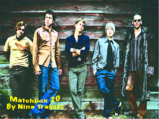
Matchbox 20 Soundslide


My SoundSlide project required taking my PowerPoint project and putting it into a new program. This program made it capable for me to post my slide show in my blog! The goal of uploading my PowerPoint to soundslide was so that I was able to have it on my blog and also have the work I did with the Audacity program online. I wanted my audacity to be perfect, I used the beginning of the song "Unwell" by Matchbox 20. I think my final turned out really well =). My goal was to use audacity so that my final did not sound like it had been edited. I also really wanted to learn how to post a slideshow online so that I can display to other people my hard work.
The most challenging part of this assignment was that I missed the class on audacity, so I had to fool around with the program on my own to figure out what to do. I had some help from my classmates but reading their notes and trying to figure it out is not as easy as taking my own notes in class. I had never worked with the audacity or soundslide programs before so that was an added challenge.
What I enjoyed most about this project was being able to share my slide show with music to whoever reads my blog! (Not sure if that is a lot of people, but I could always start sharing this link with friends and family outside of my Commm class)
I am most proud of figuring out somewhat on my own how to use these programs. Missing an ecomm class puts you fairly behind! Note to self: Don't miss another.
With more time, I would have experimented more with the audacity program and maybe not just used songs by Matchbox 20. I am glad I now know how to work that program so if I ever need music mixed again I can do it on my own!

Monday, April 5, 2010

Poster


I am currently in an Advertising class and a Consumer Behavior class, so having an assignment that dealt with how to attract attention was really fun for me. In my classes, I learned about how marketers make their product appealing to certain customers. Advertisement has alot to do with how well a product sells, or how many people go to an event. This project we had to "advertise" an album release party. My goal in this project was to used what I learned in my other classes along with using the functions of QuarkXpress to create an eye-catching poster. In my design I wanted a dark background with brighter font colors on it. I wanted to use a picture of the band so fans can relate to it, and I wanted to limit the amount of text because a student passing by this poster will most likely not stop to read the fine print. I executed my poster in a simple lay out and chose to use a gray scale type background to keep it simple. Since yellow draws the most attention, I wrote most of the important details in either yellow or green.
The most challenging part of this assignment was that it was in a new program, QuarkXpress. Learning to master this program was pretty difficult because it is less self explanatory than Photo shop or PowerPoint. Learning a new program requires more time than using a program I am already familiar with. Because of this, I spent a lot of time in the lab perfecting this project. Another challenge was making a layout that was aesthetically pleasing but still conveyed the information directly.
Though I said learning the new program was my most challenging aspect, I also found it the most enjoyable. What I like most about this class is learning how to use programs I had no idea even existed. Once I figured out how to use QuarkXpress, I became quite the fan of it. I found myself getting really excited when I finally figured out certain aspects of the program I had struggled with before. I am also proud of my final product of the assignment, so seeing my progress is another thing I liked most about this project.
I am most proud of learning how to use Quark. When I first started using it, I thought I would have to recreate my whole idea because I could not figure out how to use Quark so that it produced what I wanted it to. After I finally stumbled across the right tools I was looking for, I was very proud.
With more time, I would have done two drafts of this poster and then picked out of the two which would be my final. I feel like if I had made two completely different posters, I could have combined my favorite attributes to make a poster I was in love with. Many of my ideas I had to scratch and redo, so making multiple posters would have allowed me to do all I wanted and then make a final that incorporated all my favorite parts.

Monday, March 29, 2010

Rationale for Power Point


For my power point project I chose to do the band Matchbox 20. This project included doing brief research on the band and also finding photos that I would use in my project. What I was hoping to achieve aside from completing project guidelines was: further knowledge in a band I really like, learning how to make future power point projects more fun and exciting, learning how to attract my viewers attention without clouding up information and distracting my audience and also how to make an effective chart for the comparison table. Some decisions that I made in order to accomplish my goals were choosing to make my power point fairly simple. Although I wanted to learn how to make aesthetically pleasing power points, I did not want the attention of the viewer to shift from the information in front of them to the bells and whistles I used in my project. Because of this, I chose simple backgrounds for slides with a lot of text on them. For slides with less text, I used pictures of the band to attract the viewer.
Some things I found challenging in this project was learning how to make slides as affective as possible. Another thing I found to be challenging was how to determine what typeface colors were most effective on a slide with a background image. Professor O'Connell said yellow popped the most, but yellow was not always the prettiest option. I had to play around with the colors of my fonts a lot to make sure that they were easy to read. Another challenge in this project was initially timing the music to the slides. It took many tries to get my slides to move in coordination with the music. For most of these problems I would consult a friend for a second opinion. It made it a lot easier to discuss with other students in the class my issues because they had already dealt with the same problems or had more insight on the topic than I did.
What I enjoyed most about this project was researching the band. I had never looked that deeply into Matchbox 20's music but after this project I am a very knowledgeable fan. Another aspect I liked was that the program used for this project was PowerPoint. Having a PC, the only program we have used so far that I have on my own computer is PowerPoint. I am excited to use the skills I learned for this project in my future PowerPoint's for other classes.
I am most proud of my "Fast Facts" page. I just like the way it turned out. I have a picture of the band on the left side of the page, with 3 bullet notes of information to the right of it. The bullets are the bands logo, and then in the bottom left of the page I used to logo again. I coordinated my colors really well on this slide and I am very proud of how it ended up looking.
With more time, I would have made my chart more fancy. Though the simplicity makes it easy to read and direct, it is somewhat boring to look at. I wish I had maybe used a background image, or at least used a less basic font. Oh well, I think it turned out great anyways!

Thursday, March 11, 2010

Digital Millennium Copyright Act (DMCA)

To preface this blog, I had completely no idea what the DMCA was when I was first assigned this project. Though at first I wished I got a topic like Twitter so I could put in more personal experience and relate to the topic, I am happy that I got a topic that I knew nothing about. I'm happy I learned about it too because with the advancement of social media and web 2.0 it is important to know what the rules with online content are. So here goes nothing:
The Digital Millennium Copyright Act (DMCA) for short is an American copyright law that criminalizes production, use and distribution of technology, devices, or services. Essentially what this law does is worsen the penalties of copyright infringement on the internet. This law was passed on October 12, 1998 by a unanimous vote in the United States Senate. The law was then signed by Bill Clinton two weeks after.
One potential loop-hole in this law and one that I myself was wondering about was who gets in trouble for a website that contains links to other sites with illegal material. There have been no cases in the US where a website owner has been found liable for have links to this type of material so it has yet to be decided how it would be handled.
I think that this law is very important. It is way too easy to just copy and paste material found online, and put it anywhere. I do not have any "professional" websites but I do have facebook, twitter and now this blogger account. Learning about this law has made me realize I should be careful with what I post because it could be copyrighted material.

Refrences:
http://en.wikipedia.org/wiki/Digital_Millennium_Copyright_Act
http://www.copyright.gov/onlinesp/

Tuesday, March 2, 2010

Animated Font Poem

Here is my final version of my animated GIF. This project involved combining my font poem with my "postcard" (exquisite corpse). This project involved finishing my font poem and then using the Animation tool in Photo Shop to make the words appear at different times.

What I was hoping to achieve in this project was not only the requirements for the project but also taking the tone of my quote and best representing it by the fonts, colors and pictures used in my animation. I wanted the overall design to be somewhat magical, because the quote is about fantasizing about the future. Because of this, I chose mainly pink, script like fonts to emphasize the somewhat princess fairy tale every girl hopes for. The picture used at the end of my animated was a combination of an image from Grey's, a castle and a pink rose. All of these choices I made were to make my poem feel like a fantasy.

What I found most challenging in this assignment was my limited knowledge of the program Photo Shop. Thought I pay attention in class and take notes there were still some things that I could not figure out. Often I would get frustrated, but after spending extra time in the lab and asking my classmates, I was able to figure out what to do. My main problem was figuring out how to have my postcard appear as the last image in my animation. I did not realize it had to be the bottom layer and hiden behind all my font poem work. Once I figured this out, it was a breeze to edit.

What I enjoyed most about this project was the creativity it allowed me to express. I got to use my imagination and I liked finding images that matched the quote. Again, I enjoyed learning about a program I do not know much about. Hopefully by the end of this class, I will be a photo shop master!!

What I am most proud of was the fact I even accomplished this. At first, I thought it was almost impossible to add the postcard image at the end of my imagination. Completely this what I thought was impossible task was a really great feeling.

With more time, I would have played around with the tweening effects, or messed around with the way that the words appeared. I would have liked to have my words come from different directions, or have my frames fade into one another. Oh well, save that for the next project!!


Sunday, February 28, 2010

Post Card

For this assignment, I took the words of my font poem and found pictures that related. Since my quote was from Grey's anatomy the base picture I used is a scene from Grey's. It has the two main characters Meredith and Derek, starring longingly into one anothers eyes. I then took a picture of a castle, because whenever I think of "fantasies", I think of fairy tales and princesses and castles. I made the image transparent and put it in between Meredith and Derek. I think took a picture of a rose and blended it into the background as well. Though my picture is simple, I am really proud of the outcome. All of these programs are very new to me so even being able to layer photos was an accomplishment for me.


Tuesday, February 23, 2010

Font Poem

I chose a quote from a voice over from Grey's Anatomy. Grey's is my favorite TV show, and the quotes at the beginning and end of the episode are sometimes the best part of the whole show.

What I wanted to accomplish in this project (aside from the project requirements) was a knowledge of typefaces and how to use them to alter the mood of a piece. I never experimented much with font so this was a way for me to see what new fonts look like, and play around with photo shop to edit them to my liking. I ran into some frustrations while doing this project. The first and main problem being that I would know how I wanted a word to appear and what type of font I wanted, but I wouldn't be able to find exactly what I was looking for. I would click through font after font trying to find the perfect cursive or boldness to match my words.

What I enjoyed most about this project was learning new fonts that I never knew even existed. I liked playing around and seeing how drastically different a word can be read when the typeface matches the feeling and mood of the word. This project was helpful in me learning more about photo shop, because as I said before I haven't been able to experiment with the program until my time in this class.

The main font that I used for the quote was Georgia. I used a simple font with serifs for most of the text because I did not want to clutter my poem. The other fonts I used were: Snell Round hand (for 'fantasies' and 'dream'), Legacy Serif (for 'dissolve'), bold-ed and text warped Georgia (for 'banished'), Nueva (for 'try'), and Freestyle Script (for 'live').

Given more time on this project I would have tried to separate the words more, and make it so that it is less in lines. If I knew more about photo shop I probably also would have used cooler effects on some of the words.


Thursday, February 18, 2010

Contact Sheet Assignment!

Contact Sheet Assignment


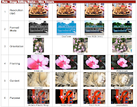
The contact sheet was our first assignment. I had never used photo shop before this class, so it was a great way to be introduced to all the capabilities of the program. I enjoyed this project because it utilized pictures that I had taken on my own. Through this project I learned many ways to edit images using photo shop.

The first row of my contact sheet was changing the resolution of a photo. Though on a screen it is hard to tell the difference, changing the dpi (dots per inch) has a great effect on the image once it is printed. I chose an image I had taken of a platter of food. The picture was fairly detailed, so when I changed the amount of pixels from 72 all the way up to 1200 dpi, it was very noticeable even on screen. This exercise was beneficial to me because I learned why sometimes my photos are blurry, or why some show up perfectly clear and large. I learned the importance of knowing the size of a photo and how many pixels it has before editing it.

The second row was format/mode, changing the colors of the image. For this row we changed a regular RGB (used for computer screens) to other color formats photo shop allows you to use. We first changed the image from RGB to CMYK (which is used for printing photos). You can clearly see how much brighter the colors become after switching to this format. After doing that we changed the photo to black and white. After making the photo black and white, we could then change it to duo tone. Duo tone was a format I always liked the look of, but never knew how it was done. I loved being able to play around with the main color of the image, and I really like the aqua blue that I created.

The third row was orientation. For this row we took a picture and changed it to landscape, portrait and square. Though I had heard all those terms before, I was not sure what it meant in terms of editing the picture. The portrait one focused on the center of the image, the golden retriever, while the landscape included more of the background and the ground that the dog was on. The square picture made it so all four sides of the image were equal.

For the fourth row we got a chance to mess around with the framing of the image. I chose a picture of a pink flower that I had taken. I took the original of the image and zoomed in and cropped the flower. You could still see it was a flower, but it was a very close up view of it. The two middle pictures were increasingly zoomed out, showing more and more of the leafy background that the flower was set in. Finally the wide angle was the original image, where the flower appears much smaller and the background takes up most of the photograph.

The fifth row was called content. For this row we used an image that when zoomed in, it was unclear as to what the picture was of. For this photo, I chose a picture I had taken of my cat. For the abstract view, I zoomed way in, so that the cat's fur appeared as just beige fluff. As the picture was zoomed out further and further you could start to tell that the picture was in fact of a cat. The representational image showed the cats full head and some of its body.

The sixth row of my contact sheet was called purpose. For this row, we changed the filters. We started with the journalistic (original) copy of the photo and from that added filters that altered the picture's appearance. The three filters I used were patchwork, water paper and plastic wrap. This row was a lot of fun because I always wondered how people made their photos look so cool and this is how!

Though this project was very frustrating to me at times, I ended up being very proud of my final project. The skills that I learned were ones that I can utilize outside of class on my own pictures. I liked doing the 5th and 6th rows the best. I liked zooming in on a picture so much that you couldn't tell what the original image is. I liked how my 5th row ended up looking. I feel the same about the work I did in the 6th row. Filters is something that I will use on my own pictures that I take (and put on facebook, twitter etc). This project gave me insight to photo shop and how it works while still having fun editing my own photos.

What I had trouble with on this assignment was remembering to change the dpi and size of the photo before using them. I often would start right in on editing the photo and forgot to do that and then have to start over. At times I was also frustrated with how fast we learned the content in class. After spending some of my own time in the lab, I finally got the hang of how to edit all these images correctly.

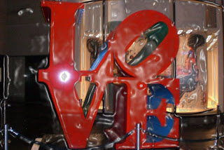
The picture below is my favorite image from the contact sheet. First of all, I love this photo I took of the LOVE sculpture. Adding the plastic wrap filter makes the picture look brighter and it gives the photo an 'unreal' look, which I really like. It gives the photo a lot of character that the journalistic image did not have.
I loved many of the images on my contact sheet but I could only pick one to call my favorite :(

Followers