Sunday, February 28, 2010
Post Card
For this assignment, I took the words of my font poem and found pictures that related. Since my quote was from Grey's anatomy the base picture I used is a scene from Grey's. It has the two main characters Meredith and Derek, starring longingly into one anothers eyes. I then took a picture of a castle, because whenever I think of "fantasies", I think of fairy tales and princesses and castles. I made the image transparent and put it in between Meredith and Derek. I think took a picture of a rose and blended it into the background as well. Though my picture is simple, I am really proud of the outcome. All of these programs are very new to me so even being able to layer photos was an accomplishment for me.


Tuesday, February 23, 2010
Font Poem
I chose a quote from a voice over from Grey's Anatomy. Grey's is my favorite TV show, and the quotes at the beginning and end of the episode are sometimes the best part of the whole show.
What I wanted to accomplish in this project (aside from the project requirements) was a knowledge of typefaces and how to use them to alter the mood of a piece. I never experimented much with font so this was a way for me to see what new fonts look like, and play around with photo shop to edit them to my liking. I ran into some frustrations while doing this project. The first and main problem being that I would know how I wanted a word to appear and what type of font I wanted, but I wouldn't be able to find exactly what I was looking for. I would click through font after font trying to find the perfect cursive or boldness to match my words.
What I enjoyed most about this project was learning new fonts that I never knew even existed. I liked playing around and seeing how drastically different a word can be read when the typeface matches the feeling and mood of the word. This project was helpful in me learning more about photo shop, because as I said before I haven't been able to experiment with the program until my time in this class.
The main font that I used for the quote was Georgia. I used a simple font with serifs for most of the text because I did not want to clutter my poem. The other fonts I used were: Snell Round hand (for 'fantasies' and 'dream'), Legacy Serif (for 'dissolve'), bold-ed and text warped Georgia (for 'banished'), Nueva (for 'try'), and Freestyle Script (for 'live').
Given more time on this project I would have tried to separate the words more, and make it so that it is less in lines. If I knew more about photo shop I probably also would have used cooler effects on some of the words.
Thursday, February 18, 2010
Contact Sheet Assignment!
Contact Sheet Assignment

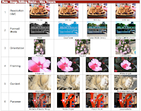
The contact sheet was our first assignment. I had never used photo shop before this class, so it was a great way to be introduced to all the capabilities of the program. I enjoyed this project because it utilized pictures that I had taken on my own. Through this project I learned many ways to edit images using photo shop.
The first row of my contact sheet was changing the resolution of a photo. Though on a screen it is hard to tell the difference, changing the dpi (dots per inch) has a great effect on the image once it is printed. I chose an image I had taken of a platter of food. The picture was fairly detailed, so when I changed the amount of pixels from 72 all the way up to 1200 dpi, it was very noticeable even on screen. This exercise was beneficial to me because I learned why sometimes my photos are blurry, or why some show up perfectly clear and large. I learned the importance of knowing the size of a photo and how many pixels it has before editing it.
The second row was format/mode, changing the colors of the image. For this row we changed a regular RGB (used for computer screens) to other color formats photo shop allows you to use. We first changed the image from RGB to CMYK (which is used for printing photos). You can clearly see how much brighter the colors become after switching to this format. After doing that we changed the photo to black and white. After making the photo black and white, we could then change it to duo tone. Duo tone was a format I always liked the look of, but never knew how it was done. I loved being able to play around with the main color of the image, and I really like the aqua blue that I created.
The third row was orientation. For this row we took a picture and changed it to landscape, portrait and square. Though I had heard all those terms before, I was not sure what it meant in terms of editing the picture. The portrait one focused on the center of the image, the golden retriever, while the landscape included more of the background and the ground that the dog was on. The square picture made it so all four sides of the image were equal.
For the fourth row we got a chance to mess around with the framing of the image. I chose a picture of a pink flower that I had taken. I took the original of the image and zoomed in and cropped the flower. You could still see it was a flower, but it was a very close up view of it. The two middle pictures were increasingly zoomed out, showing more and more of the leafy background that the flower was set in. Finally the wide angle was the original image, where the flower appears much smaller and the background takes up most of the photograph.
The fifth row was called content. For this row we used an image that when zoomed in, it was unclear as to what the picture was of. For this photo, I chose a picture I had taken of my cat. For the abstract view, I zoomed way in, so that the cat's fur appeared as just beige fluff. As the picture was zoomed out further and further you could start to tell that the picture was in fact of a cat. The representational image showed the cats full head and some of its body.
The sixth row of my contact sheet was called purpose. For this row, we changed the filters. We started with the journalistic (original) copy of the photo and from that added filters that altered the picture's appearance. The three filters I used were patchwork, water paper and plastic wrap. This row was a lot of fun because I always wondered how people made their photos look so cool and this is how!
Though this project was very frustrating to me at times, I ended up being very proud of my final project. The skills that I learned were ones that I can utilize outside of class on my own pictures. I liked doing the 5th and 6th rows the best. I liked zooming in on a picture so much that you couldn't tell what the original image is. I liked how my 5th row ended up looking. I feel the same about the work I did in the 6th row. Filters is something that I will use on my own pictures that I take (and put on facebook, twitter etc). This project gave me insight to photo shop and how it works while still having fun editing my own photos.
What I had trouble with on this assignment was remembering to change the dpi and size of the photo before using them. I often would start right in on editing the photo and forgot to do that and then have to start over. At times I was also frustrated with how fast we learned the content in class. After spending some of my own time in the lab, I finally got the hang of how to edit all these images correctly.
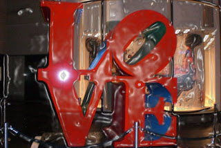
The picture below is my favorite image from the contact sheet. First of all, I love this photo I took of the LOVE sculpture. Adding the plastic wrap filter makes the picture look brighter and it gives the photo an 'unreal' look, which I really like. It gives the photo a lot of character that the journalistic image did not have.
I loved many of the images on my contact sheet but I could only pick one to call my favorite :(
I loved many of the images on my contact sheet but I could only pick one to call my favorite :(

Subscribe to:
Comments (Atom)

