Monday, March 29, 2010

Rationale for Power Point


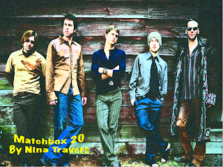
For my power point project I chose to do the band Matchbox 20. This project included doing brief research on the band and also finding photos that I would use in my project. What I was hoping to achieve aside from completing project guidelines was: further knowledge in a band I really like, learning how to make future power point projects more fun and exciting, learning how to attract my viewers attention without clouding up information and distracting my audience and also how to make an effective chart for the comparison table. Some decisions that I made in order to accomplish my goals were choosing to make my power point fairly simple. Although I wanted to learn how to make aesthetically pleasing power points, I did not want the attention of the viewer to shift from the information in front of them to the bells and whistles I used in my project. Because of this, I chose simple backgrounds for slides with a lot of text on them. For slides with less text, I used pictures of the band to attract the viewer.
Some things I found challenging in this project was learning how to make slides as affective as possible. Another thing I found to be challenging was how to determine what typeface colors were most effective on a slide with a background image. Professor O'Connell said yellow popped the most, but yellow was not always the prettiest option. I had to play around with the colors of my fonts a lot to make sure that they were easy to read. Another challenge in this project was initially timing the music to the slides. It took many tries to get my slides to move in coordination with the music. For most of these problems I would consult a friend for a second opinion. It made it a lot easier to discuss with other students in the class my issues because they had already dealt with the same problems or had more insight on the topic than I did.
What I enjoyed most about this project was researching the band. I had never looked that deeply into Matchbox 20's music but after this project I am a very knowledgeable fan. Another aspect I liked was that the program used for this project was PowerPoint. Having a PC, the only program we have used so far that I have on my own computer is PowerPoint. I am excited to use the skills I learned for this project in my future PowerPoint's for other classes.
I am most proud of my "Fast Facts" page. I just like the way it turned out. I have a picture of the band on the left side of the page, with 3 bullet notes of information to the right of it. The bullets are the bands logo, and then in the bottom left of the page I used to logo again. I coordinated my colors really well on this slide and I am very proud of how it ended up looking.
With more time, I would have made my chart more fancy. Though the simplicity makes it easy to read and direct, it is somewhat boring to look at. I wish I had maybe used a background image, or at least used a less basic font. Oh well, I think it turned out great anyways!

Thursday, March 11, 2010

Digital Millennium Copyright Act (DMCA)

To preface this blog, I had completely no idea what the DMCA was when I was first assigned this project. Though at first I wished I got a topic like Twitter so I could put in more personal experience and relate to the topic, I am happy that I got a topic that I knew nothing about. I'm happy I learned about it too because with the advancement of social media and web 2.0 it is important to know what the rules with online content are. So here goes nothing:
The Digital Millennium Copyright Act (DMCA) for short is an American copyright law that criminalizes production, use and distribution of technology, devices, or services. Essentially what this law does is worsen the penalties of copyright infringement on the internet. This law was passed on October 12, 1998 by a unanimous vote in the United States Senate. The law was then signed by Bill Clinton two weeks after.
One potential loop-hole in this law and one that I myself was wondering about was who gets in trouble for a website that contains links to other sites with illegal material. There have been no cases in the US where a website owner has been found liable for have links to this type of material so it has yet to be decided how it would be handled.
I think that this law is very important. It is way too easy to just copy and paste material found online, and put it anywhere. I do not have any "professional" websites but I do have facebook, twitter and now this blogger account. Learning about this law has made me realize I should be careful with what I post because it could be copyrighted material.

Refrences:
http://en.wikipedia.org/wiki/Digital_Millennium_Copyright_Act
http://www.copyright.gov/onlinesp/

Tuesday, March 2, 2010

Animated Font Poem

Here is my final version of my animated GIF. This project involved combining my font poem with my "postcard" (exquisite corpse). This project involved finishing my font poem and then using the Animation tool in Photo Shop to make the words appear at different times.

What I was hoping to achieve in this project was not only the requirements for the project but also taking the tone of my quote and best representing it by the fonts, colors and pictures used in my animation. I wanted the overall design to be somewhat magical, because the quote is about fantasizing about the future. Because of this, I chose mainly pink, script like fonts to emphasize the somewhat princess fairy tale every girl hopes for. The picture used at the end of my animated was a combination of an image from Grey's, a castle and a pink rose. All of these choices I made were to make my poem feel like a fantasy.

What I found most challenging in this assignment was my limited knowledge of the program Photo Shop. Thought I pay attention in class and take notes there were still some things that I could not figure out. Often I would get frustrated, but after spending extra time in the lab and asking my classmates, I was able to figure out what to do. My main problem was figuring out how to have my postcard appear as the last image in my animation. I did not realize it had to be the bottom layer and hiden behind all my font poem work. Once I figured this out, it was a breeze to edit.

What I enjoyed most about this project was the creativity it allowed me to express. I got to use my imagination and I liked finding images that matched the quote. Again, I enjoyed learning about a program I do not know much about. Hopefully by the end of this class, I will be a photo shop master!!

What I am most proud of was the fact I even accomplished this. At first, I thought it was almost impossible to add the postcard image at the end of my imagination. Completely this what I thought was impossible task was a really great feeling.

With more time, I would have played around with the tweening effects, or messed around with the way that the words appeared. I would have liked to have my words come from different directions, or have my frames fade into one another. Oh well, save that for the next project!!


Followers